ReLAB
logo redesign
Original logo
RE Lab is an organization that provides support for nurses with a specific focus on trauma-informed care. They were fond of their original logo, but one of their biggest concerns with their original logo was that people read their name as "R E" lab instead of "re-" (as a prefix). They wanted the new logo to show convey strength without being uninviting and also to add clarity to how their name was read.
initial sketches and later refinements


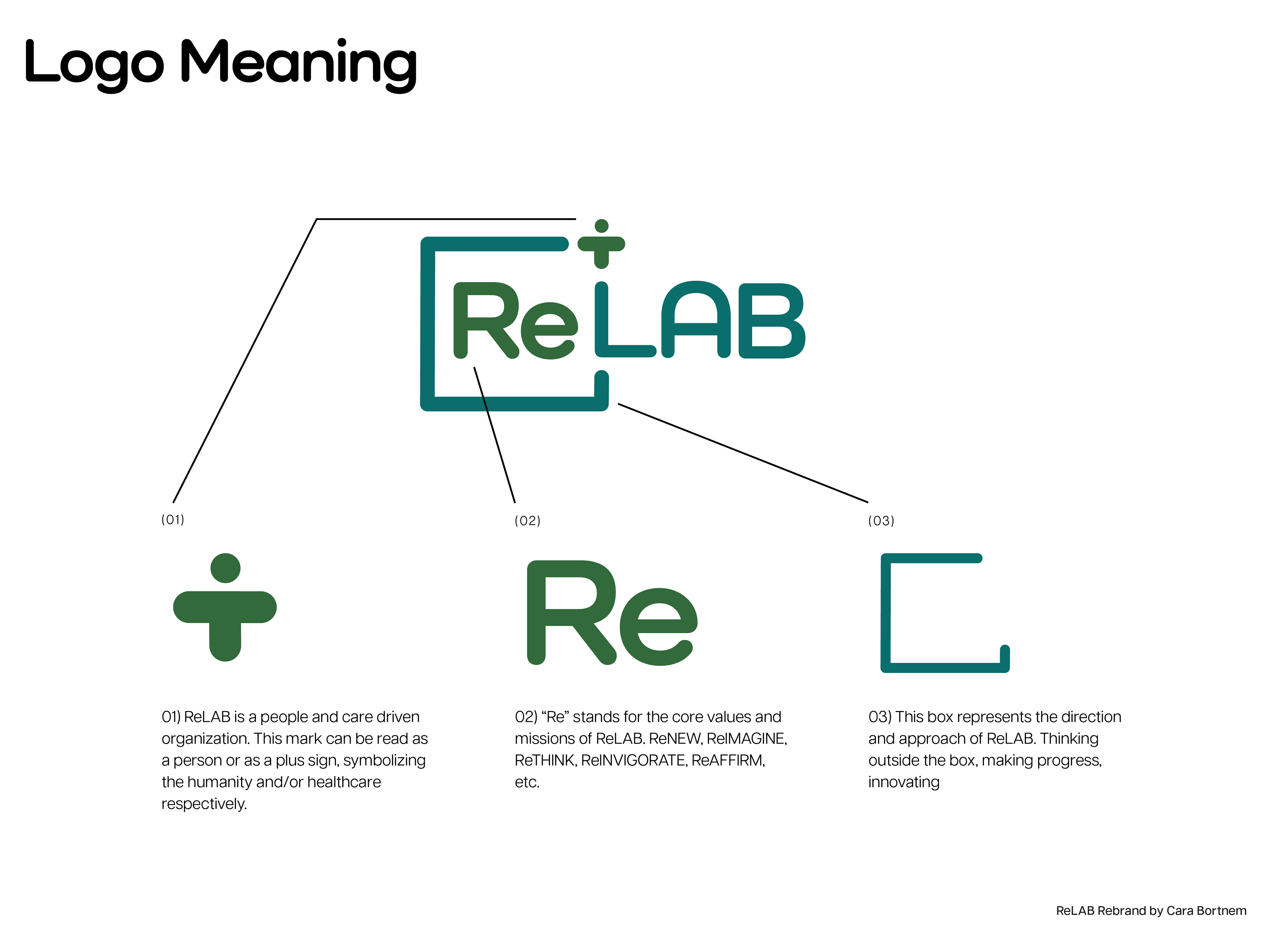
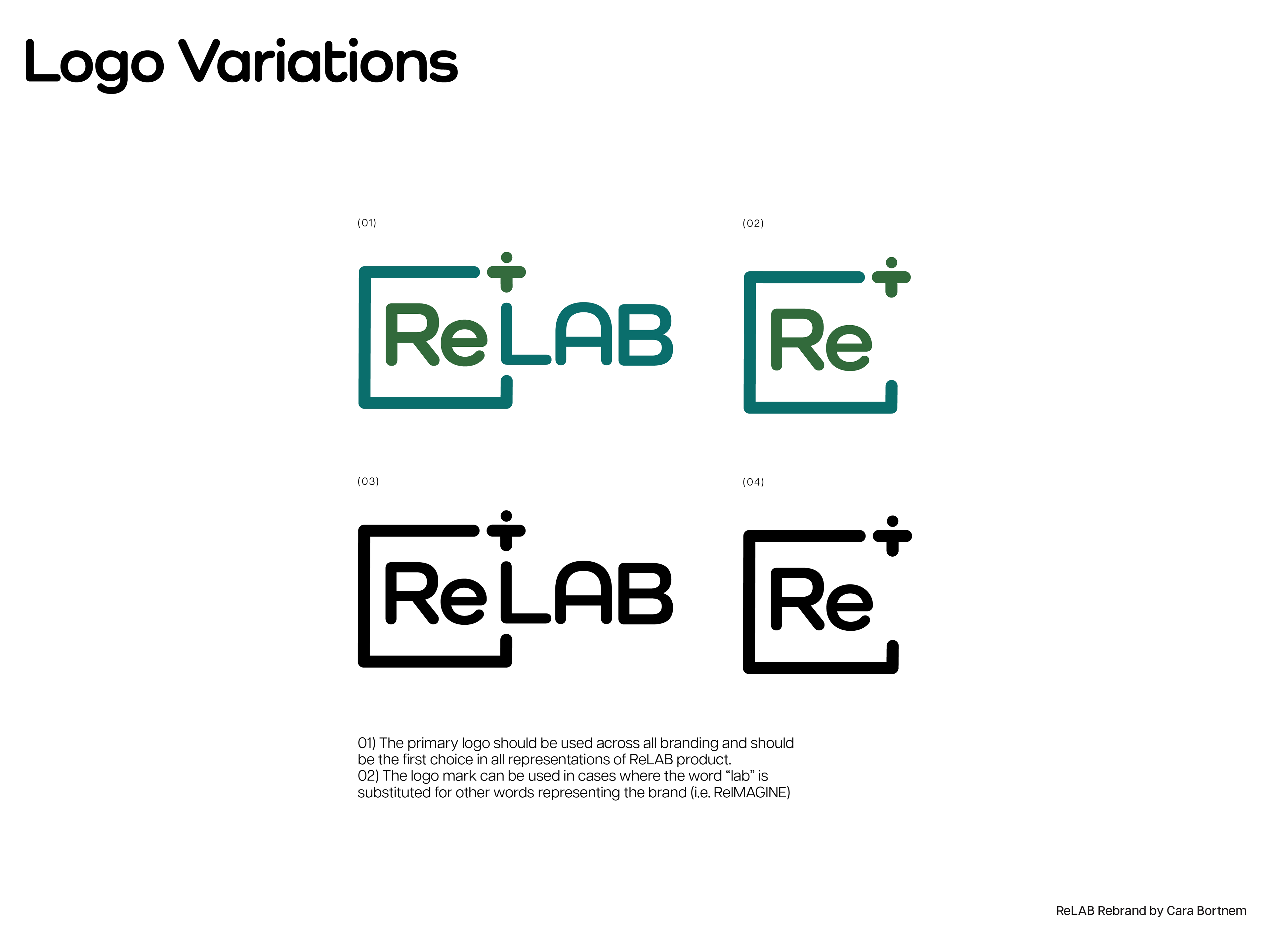
final logo redesign


